 “Okay, I am blown away by how great this looks!”
A simple marketing piece can help your small business make a big impression. I write and design all sorts of basic marketing pieces:
- Postcards that highlight your services
- Trifold brochures to hand out at an event
- Flyers to share with nearby businesses
- An ad for a magazine or program
- A template for your email newsletter
I also design everyday business documents such as forms and templates for letterhead, contracts, etc.
|
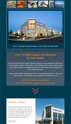
RWA email template
Design and write a marketing email template for a commercial architect. An email template makes it easy to insert images and text for the next issue, and helps maintain a consistent look. Client: Ruark & Wyatt Architects
|
|
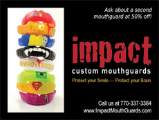
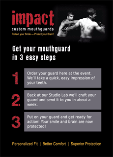
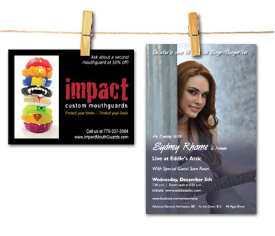
Impact magazine ad
Design a quick, small ad to showcase a client’s custom mouthguards in a roller derby magazine. Client: Impact Custom Mouthguards
"Nailed it!" |
|
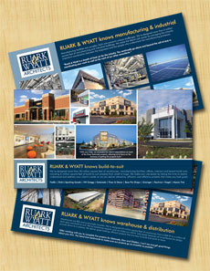
RWA building expertise postcards
Design and write a series of jumbo postcards to promote commercial architectural services. Each card focuses on the firm’s expertise in the design of different building project types: warehouses and distribution centers, build-to-suit projects and manufacturing facilities. Client: Ruark & Wyatt Architects
|
|
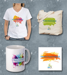
REAP promotional items
Design a series of promotional items to promote REAP’s Train | Teach | Read fundraising campaign. We ended up with five different designs to appeal to a variety of audiences: women, men, teens, kids, teachers, donors, volunteers, etc. Each of the designs is available to print on demand as a shirt, bag, mug, travel mug, sticker and magnet in the REAP Swag Shop, a custom shop on CafePress. Client: REAP
|
|
Makin’ it Work postcard
Design a postcard to promote a new tech-support business targeted at seniors and people who need help solving their technology problems. Client: Makin’ it Work
|
|
Impact table-top signage
Create a series of table-top signs to market custom mouthguards to young athletes and their parents at sporting events. Client: Impact Custom Mouthguards
|
|
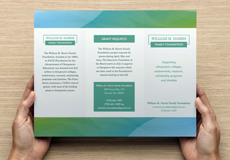
Harris Foundation logo & trifold
The William M. Harris Family Foundation asked for help spreading the word about their charitable funding. Their goal was to invite a select group of organizations to submit grant requests. Rather than broadcast their info to the world with a website, they chose a trifold brochure that board members can hand out to prospective grant recipients. I developed a simple logo and understated brochure that puts a fresh, contemporary face on this conservative organization. Client: Harris Foundation
|
|
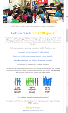
REAP email newsletters
Design and write a series of periodic email newsletters for a nonprofit literacy organization. An email template makes it easy to insert images and text for the next issue, and helps maintain a consistent look. The emails go to different audiences: educators, donors, volunteers and sometimes all three. Client: REAP
"Okay, I am blown away by how great this looks! Seriously, way more than anything I have ever done!!!!" |
|
Singer-songwriter concert poster
Design a poster to promote a concert featuring a young singer-songwriter performing at a local venue. Client: Rhett & Julie Rhame
|
|
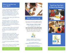
REAP trifold brochure
Design a trifold brochure to promote REAP, a nonprofit organization that trains public school teachers to more effectively teach struggling readers. The brochure gives potential donors a very basic overview of REAP’s mission to improve literacy in public school students. Client: REAP
"I love it. I love it for so many reasons!" |
|
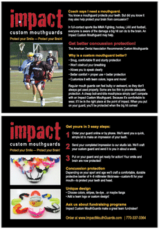
Impact marketing postcards
Design a series of sports-specific postcards/flyers to encourage athletes to buy a custom mouthguard. The postcards highlight the safety and comfort benefits of wearing a custom-fit mouthguard, and showcase colorful designs that appeal to young athletes. Client: Impact Custom Mouthguards
|
|
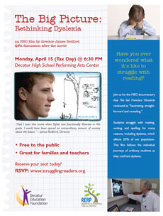
REAP event poster
Design a poster to promote a screening of an HBO documentary movie about dyslexia. The movie was sponsored by a local nonprofit literacy organization that targets teachers and parents of struggling readers. Client: REAP
|
|
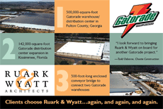
RWA marketing postcard
Create a postcard mailer to promote commercial architectural services. The postcard focused on a series of three industrial projects completed for a high-profile client. Client: Ruark & Wyatt Architects
|
|
REAP concert posters
Design a series of 22 x 28 posters to promote REAP’s concert fundraiser, plus a generic poster to be reused at future events. Rigid foamcore backing makes the posters easy to display, carry, store and reuse. Client: REAP
|
|
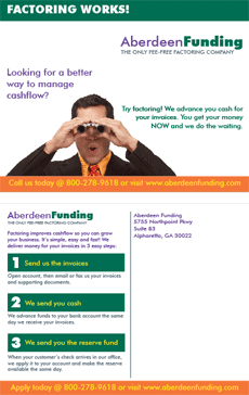
Aberdeen postcard mailer
Design a postcard to bring in new clients for a factoring company. The client wanted a fresh look targeted toward a young audience. Client: Aberdeen Funding
"Very good work! I am appreciative of the great working relationship we have. You get me!" |
|
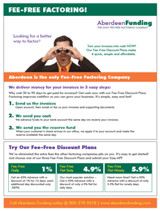
Aberdeen marketing flyer
Design a marketing flyer to target young business professionals and explain the benefits of factoring. Client: Aberdeen Funding
|
|
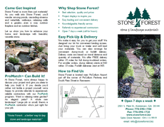
Stone Forest trifold brochure
Design a trifold brochure to promote the products and services offered by a retailer of stone and natural landscape materials. The brochure is designed in Word for easy updating and printing from a desktop printer. Client: Stone Forest
|
|
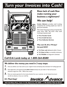
Invoice Advance high-impact flyer
Design an inexpensive, high-impact flyer to grab the attention of trucking companies that want to receive fast payment for outstanding invoices. Client: Invoice Advance
"Looks good. Thanks for the great work!" |
|
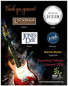
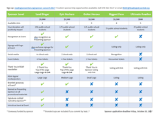
REAP fundraiser sponsor grid
Design a sponsor grid to highlight the sponsorship benefits for a fundraising event to benefit a nonprofit literacy organization. Client: REAP
|
|
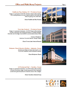
RWA statement of qualifications (SOQ)
Create a professional-looking, inexpensive marketing package for a start-up architecture firm. The package includes a series of mix-and-match sheets: project & client lists, corporate résumés, etc. The architects can update the materials in-house to produce customized packages with a desktop color printer. Client: Ruark & Wyatt Architects
|
|
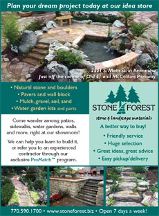
Stone Forest magazine/newspaper ads
This magazine ad encourages readers to visit the showroom of an upscale retail store that carries stone and landscape materials. This is one of a series of ads—both color and B&W—designed for local magazines, newspapers and Yellow Pages. Client: Stone Forest
|
|
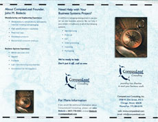
CompassLead trifold and marketing package
Design a mini marketing package for a start-up consulting firm. A tall, narrow folder holds step-cut project sheets and a trifold. The package fits a #10 envelope or shirt pocket, and is produced on a color laser printer using pre-printed paper. Client: CompassLead Consulting
"...I'm very, very happy. The stuff looks great! I'm proud to be able to put these brochures out there. Thank you for your quick attention and great service. It's always a pleasure working with you." |
|
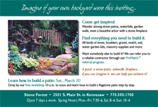
Stone Forest marketing postcard
Design a postcard to encourage homeowners to visit the showroom of an upscale retail store that carries stone and landscape materials. Client: Stone Forest
|
|
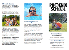
Phoenix School summer camp trifold
Overhaul an outdated black and white brochure to make it effective, fun and easy to read. Color photos replace clipart. The text was heavily edited, adding bulleted lists for quick reading. The brochures are printed directly from a desktop color printer. Client: The Phoenix School
|


