 Writing & Editing
As you write, put yourself in the reader’s shoes; what would he or she want to know about your business? Try to anticipate and answer these questions in your writing.
Use a spelling and grammar checker. Poor spelling or grammatical errors can make people doubt your professional capabilities. If spelling or grammar is an issue for you, have a co-worker check your important documents before you click send.
Use bullets and subheadings to break text into small, manageable sections that are easy to skim.
Explain the benefits a client/customer will gain from using your business (rather than just listing what you do).
Design & Marketing
To save time, use styles to make formatting much simpler (and faster) in your word processing documents. When you need to change the font, size, color, etc., it takes just a few clicks to update the text format in your whole document.
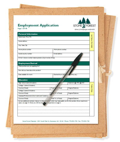
Create a locked template (.dotx) for each of your frequently-used forms in Microsoft Word to make sure your company’s documents look consistent each time, no matter who is using them.
Do a thoughtfully designed, inexpensive postcard mailing to stir up some business. People can skip over your emails, but the recipient can’t help but read the postcard since it’s right there out in the open.
Use your logo consistently in all your printed materials, forms and online marketing. If other companies use your logo (in a presentation, website, ad, directory listing, etc.), make sure they use it consistently and correctly (correct size, shape, color. etc.). A stretched, blurry logo might make people think you’re unprofessional.
Give your phone number, email and other contact info in prominent places throughout your design. In printed marketing materials, put your complete contact info in a conspicuous place that’s easy to update. If you plan to use custom folders and want them to stay relevant for a long time, don’t put your contact info on them. That way you can keep using the folders if you move (or get a new email address or whatever), instead of throwing them out. Put your contact info on other materials that are cheaper to replace.
Design your marketing and business materials to have a consistent look, from your website, emails and Facebook page all the way down to your business forms.
Leave some white space on the page rather than cramming every inch with text or graphics. Your message will stand out more clearly if you give it some breathing room.
Limit yourself to two or three fonts—one for headings and one for body text—and use them consistently throughout all your document, website, email, etc. In most cases, the fonts should match or complement your logo.
Use photos and graphics to add visual appeal to your documents and reinforce your message. Choose images that share a similar look and color scheme.
Use high-quality images in your printed documents. Don’t paste in low-resolution images copied from the web, and don’t stretch a small image to try and make it bigger. A small image that looks fine on a monitor will look terrible on a printed piece. A color image in a printed piece should be at least 300 dpi at its final printed size.

