Quick Tips
Write for your audience; tell them what they want or need to know.
"What's in it for me?" Clearly state the benefits for the reader.
Use bullets and subheadings to help readers skim information quickly.
Don't crowd the design with too much info; leave some white space.
Provide accurate contact information in a prominent place.
Maximize Your Marketing Materials
Uh-oh. The boss just asked you to put together a new marketing piece for your company, and you’re in a panic. Don’t worry…you can make it great! We’ve put together some tips to help you make the most of your flyers, postcards and even your website.
Planning
The most important goal for any marketing piece is to get your message across. Think carefully about your marketing piece. What should it accomplish? Who will be reading it? Should it be conservative, trendy, serious, fun? Should it be a brochure, email, postcard, web page, flyer?
Written Content
The key is to focus on what your readers will want/need to know. Try to anticipate questions they might have, and use language familiar to them. Use bullets and subheadings to break up the text, and to emphasize important points for quick reading. Keep your information as succinct as possible. In most cases, you won’t need to tell the whole story; instead, offer just enough information to get readers to take the next step.
Convincing the Reader
Testimonials and client lists give instant credibility; it’s very convincing when others have good things to say about your business! Your text should also answer the question “why choose us?” When marketing to an audience unfamiliar with your type of business or organization, use your materials to help them understand what you do, and explain how they might benefit.
Design
Your design should enhance your message, rather than contradict or overwhelm it. Don’t feel compelled to cover every inch of paper or screen—a good design should have some “white space.”
Design Basics
For beginners, consider a simple centered or justified alignment, using two typefaces (heading and body) and two or three colors. If you plan to add graphics, choose one design theme and stick to it. The goal is to create a consistent look, using good-quality images and photos that emphasize your message. Create a basic layout that you can adapt for use on all your marketing pieces to help reinforce the identity of your group or company.
Pre-Fab Designs & Resources
If you’re unsure about your design skills, try a pre-printed paper: brochure “shells,” postcards, folders and more—all you do is add your own text. Check out www.paperdirect.com and www.ideaart.com. There are also plenty of design templates on the web for you to download and adapt using Microsoft Word.
If you need a significant quantity of cards, trifolds, etc. check into an online printing company like Printing for Less or VistaPrint. They have online design resources that help you create great-looking printed materials at really affordable prices. Just make sure you upload high-quality images, not fuzzy web-quality images.
Trifold Brochures
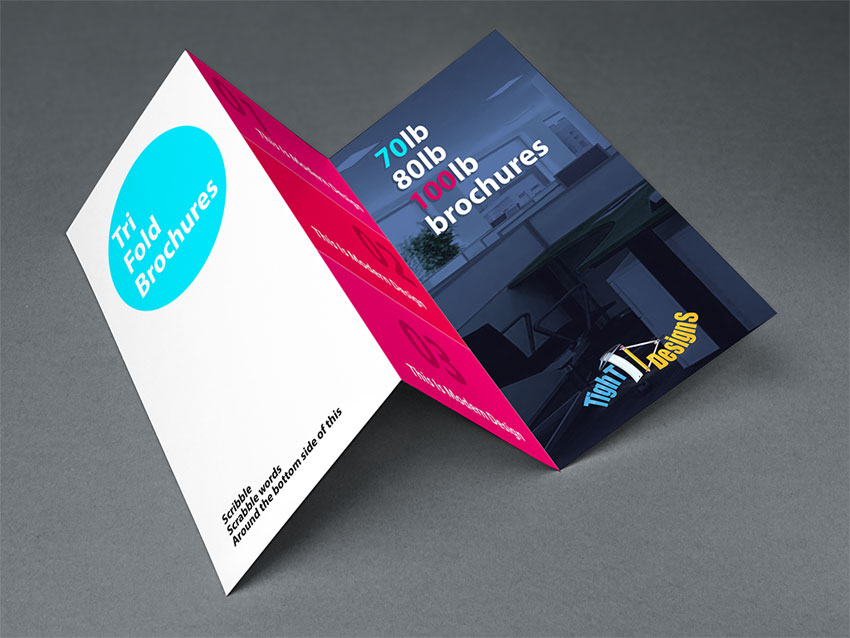
Brochures are the most common piece in a small business marketing program, and they can take many shapes. A trifold is very useful if you need to convey a small amount of information, or tailor a brief piece for a specific event. They’re very portable and fit in a #10 envelope (and a jacket pocket).
If you need more room, try a series of 8½ x 11 sheets. This is a great system if you need to customize brochures, or update your materials often. Present the sheets in an attractive folder, or bind them with coil or wire binding (just avoid the old-fashioned “GBC” comb binding).
Flyers
Go for maximum impact; make your message very clear. People decide within seconds if they will keep a flyer or trash it. Include a coupon with dashed cut-out lines, or use an eye-catching font or image to promote an event. Don’t overcrowd the page, and keep text brief. Remember, even though flyers are cheap to make, your image is at stake; make sure the flyer looks professional, attractive and error-free.
Postcards
Postcards are a great way to market. Use postcards to highlight a single topic: an event, a new service, a specific type of product, etc. Keep the message brief; use jumbo postcards for extra room. I like 6″ x 11″ postcards because they’re BIG but cost the same postage as a regular business envelope. For a great promotion, send a series of related, themed postcards. Mail cards without an envelope for maximum impact. Pass out postcards at events. Leave a stack on your front desk and at neighboring businesses.
General Tips for Marketing Materials
- Put contact info in a prominent place: phone, fax, address, url (www.acme.com), etc. If you give an email address, respond promptly to all messages.
- If you give a url, be sure your website is up to date; don’t give a url if your site is under construction!
- Maintain a consistent image for your company (same basic colors, typefaces, etc.) on all marketing pieces.
- To increase response, offer a coupon, discount, free consultation or other incentive.
- Close with a “call to action” such as: “… email your completed survey to bradkeefer@ACME.com” or “… call 404-555-1234 to order your ACME widget.”
—by Eve Wyatt: web, writing and design for small businesses
Also check out the How-To articles Tips for Working with a Designer or Writer and Developing a Basic Marketing Plan


